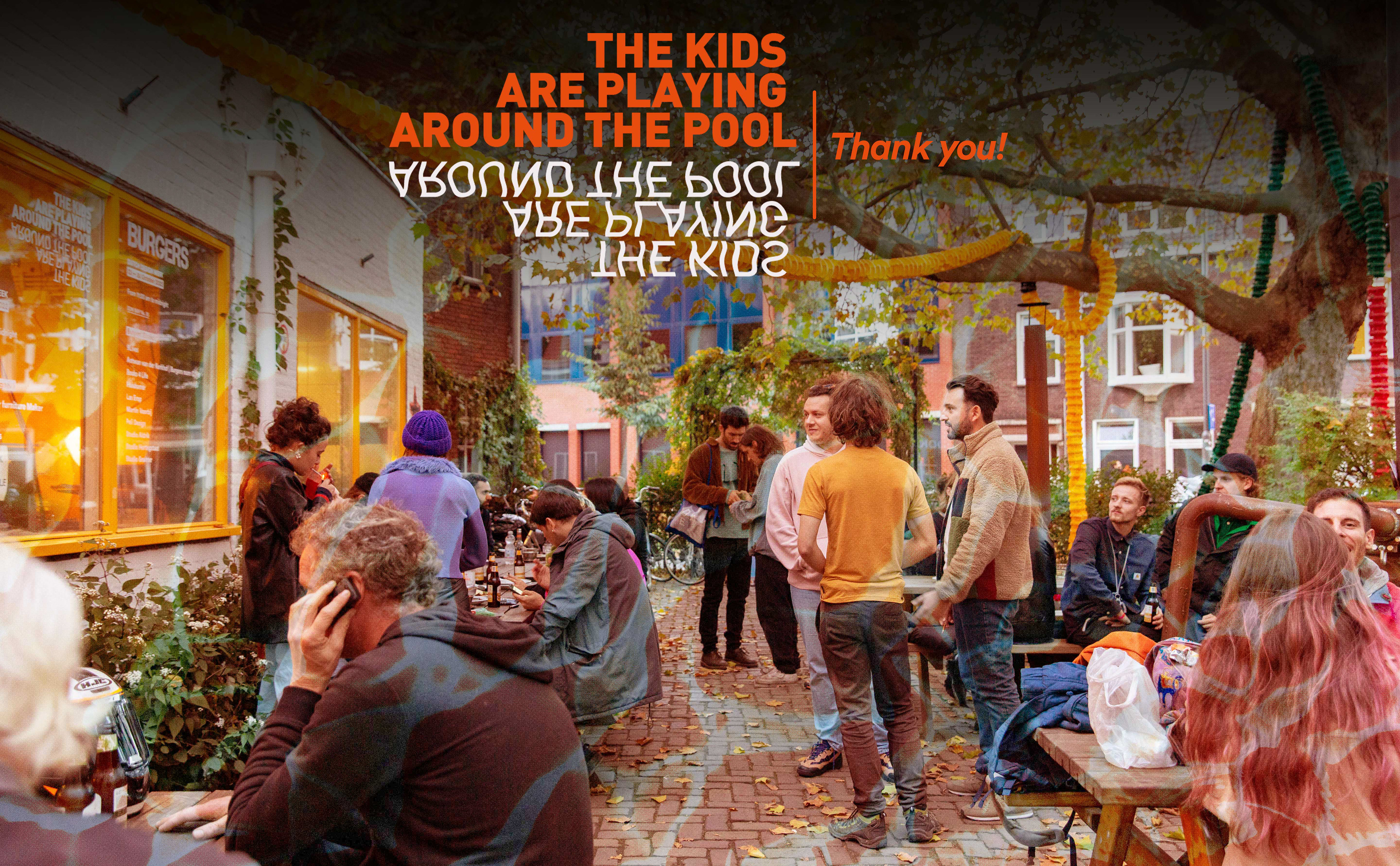
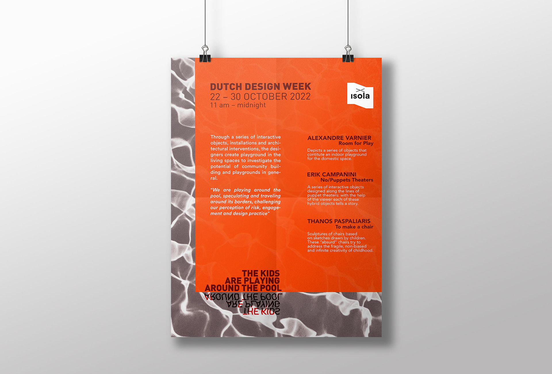
"The Kids are Playing Around the Pool" is a design collective from Eindhoven that is part of the isola.design platform. Its designers asked Isola to make their visual identity for their exhibition during the DDW 2022.
They were very unsure about what they wanted to achieve in the beginning so I had to try different approaches for their logo and exhibition poster in order to know what would represent them best while still following Isola's design lines.
The work consists in:
✦ Logo Design: a typographic logo that is clear and minimal while still conveying its meaning.
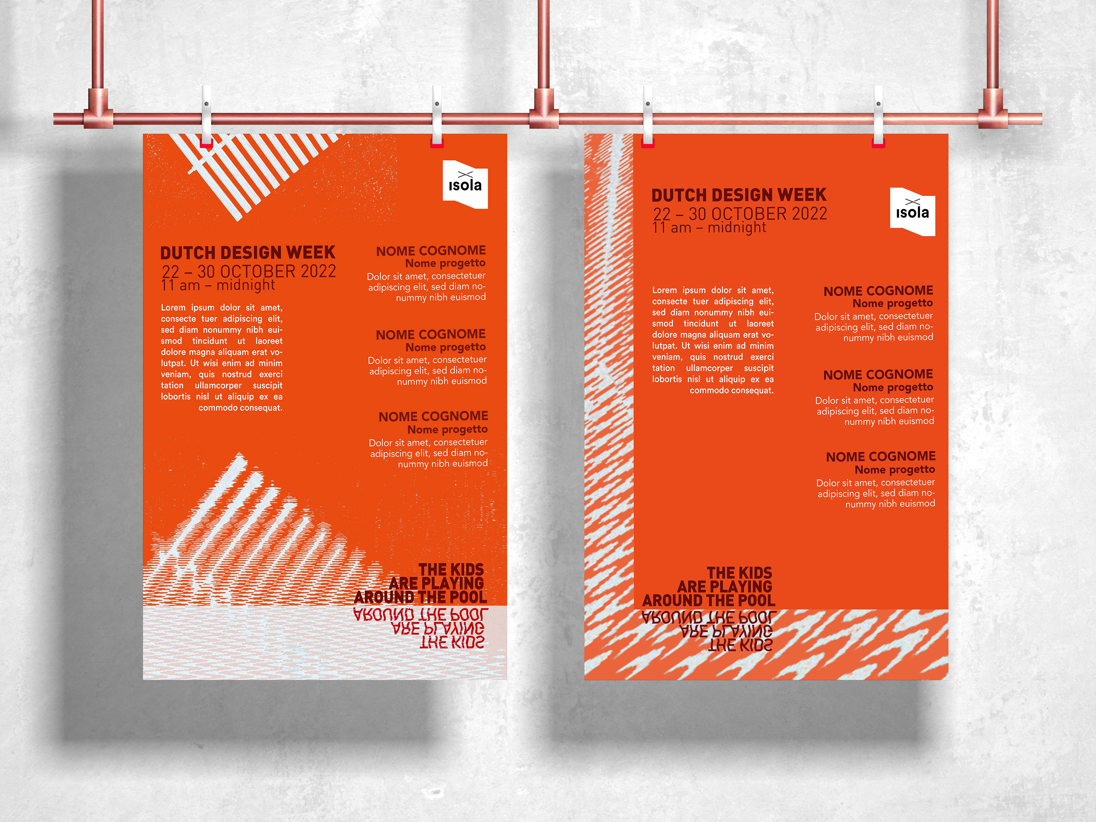
✦ POSTER Design: made to announce who they are and what they stand for as designers to whoever visits their spaces.
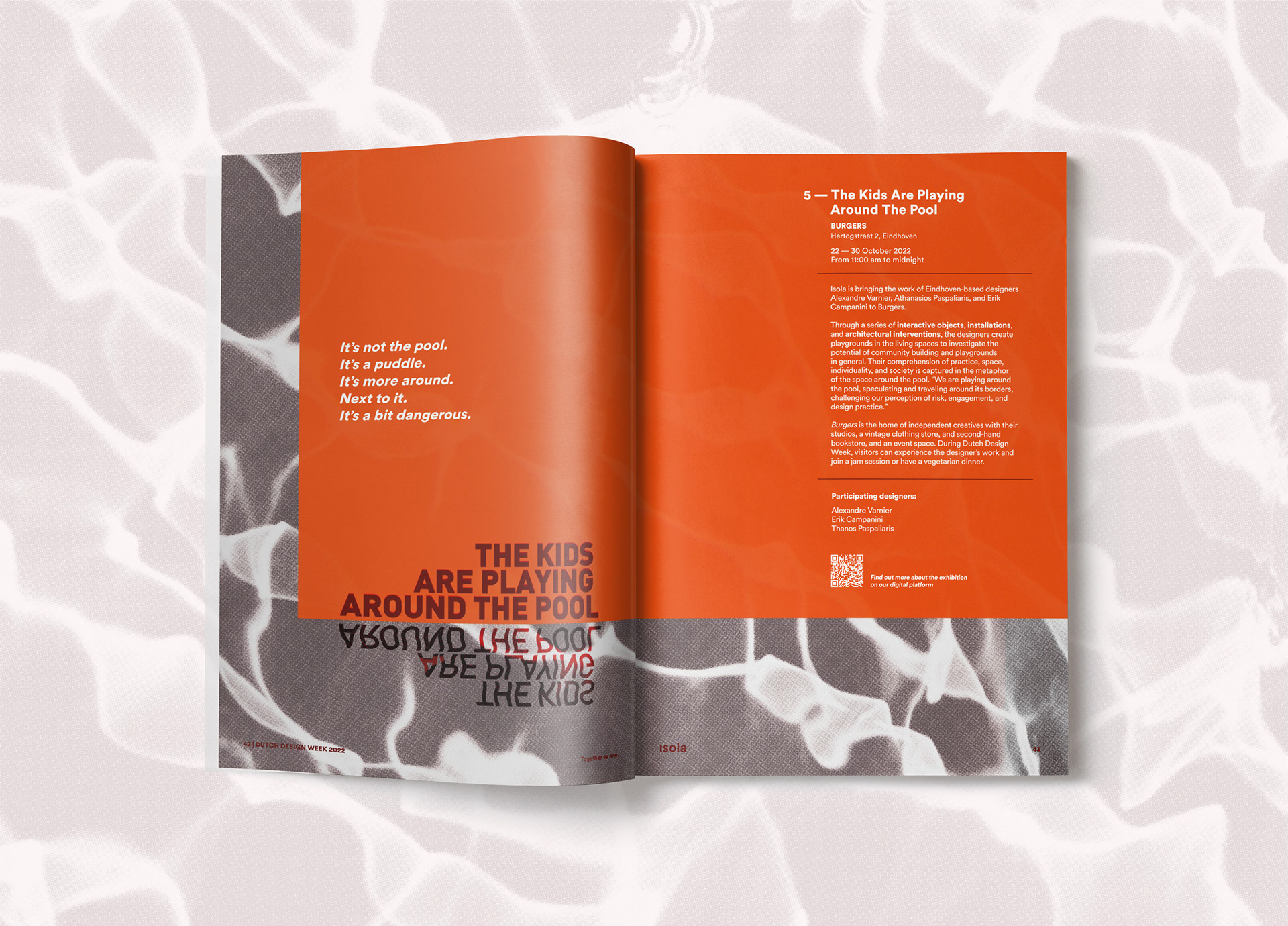
✦ EDITORIAL Design: designing the page inside the DDW22 booklet distributed to guests, designers and visitor during the whole festival run by Isola.
The Process
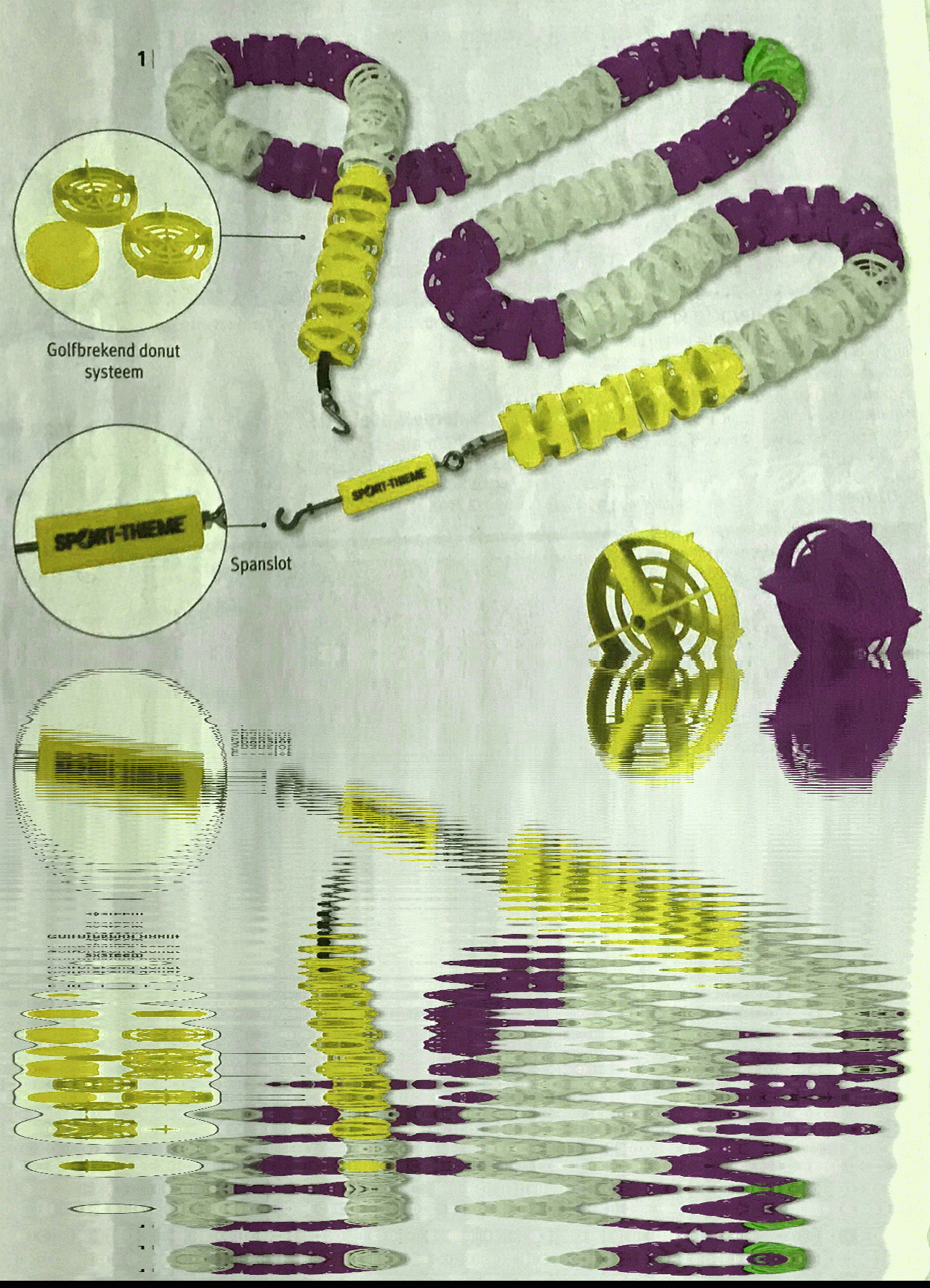
The designers initially gave Isola some images that they made, which felt that represented their overall vibe. When they took part of Isola their visual approach needed to change to be more visually cohesive with the rest of the designers that were part of the festival.
Here are the materials provided by them which I used as a starting moodboard:
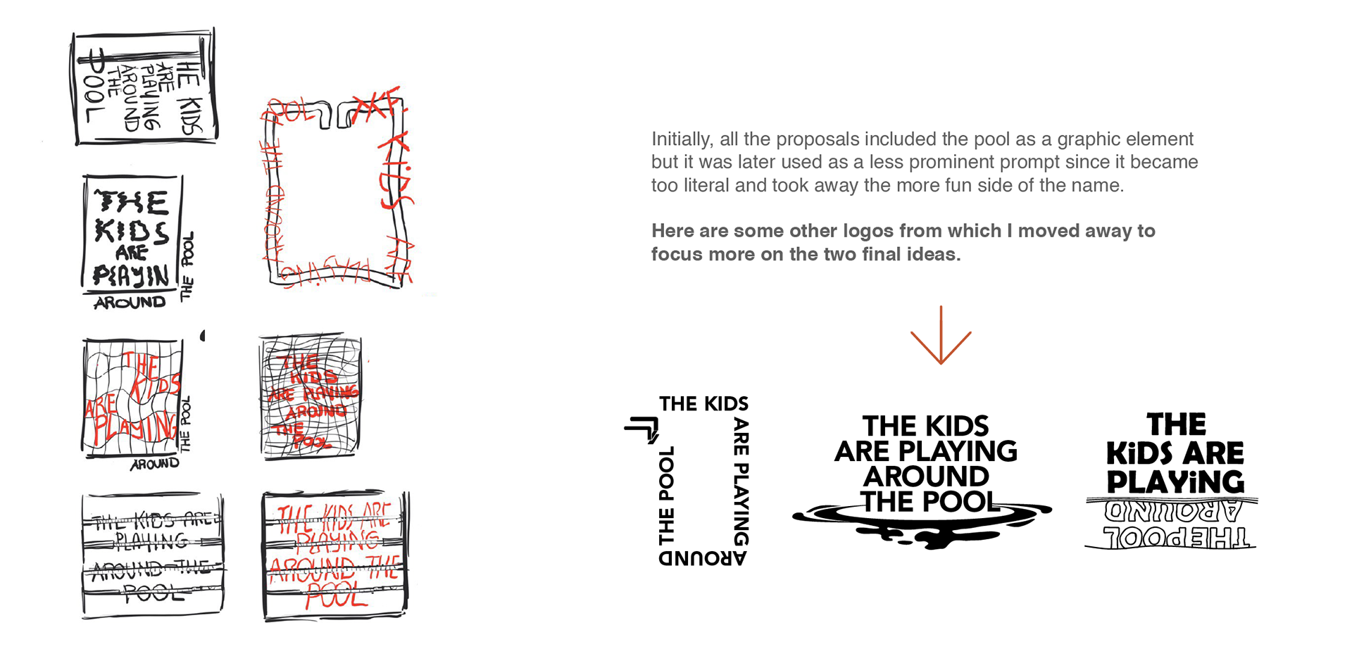
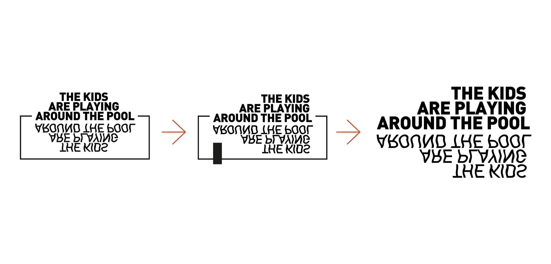
First logo ideas
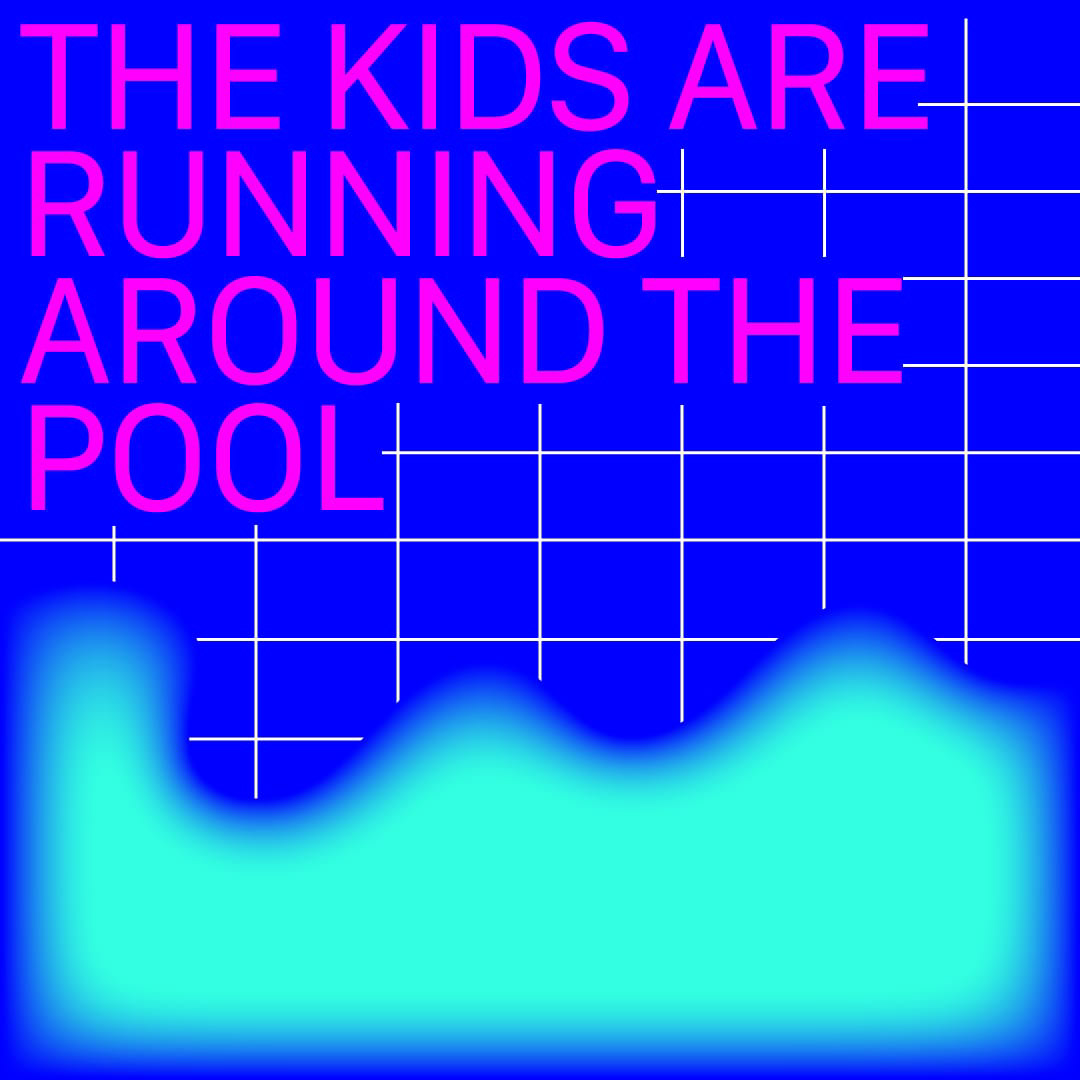
First IDENTITY PROPOSAL
For every visual identity were made no less than 3 different propositions
with the same palette and graphic approach.
Second IDENTITY PROPOSAL
This other idea came after Isola and the designers settled for the definitive logo, seen below. This made me redo the layout from zero. For this proposal I took the elements that the designers saw as typical for a pool but not as nice or pretty: most of them have a technical and maintenance purpose.
I incorporated the elements in a more vector-based style using large color blocks, veering more towards a minimal style as requested by Isola's art director.
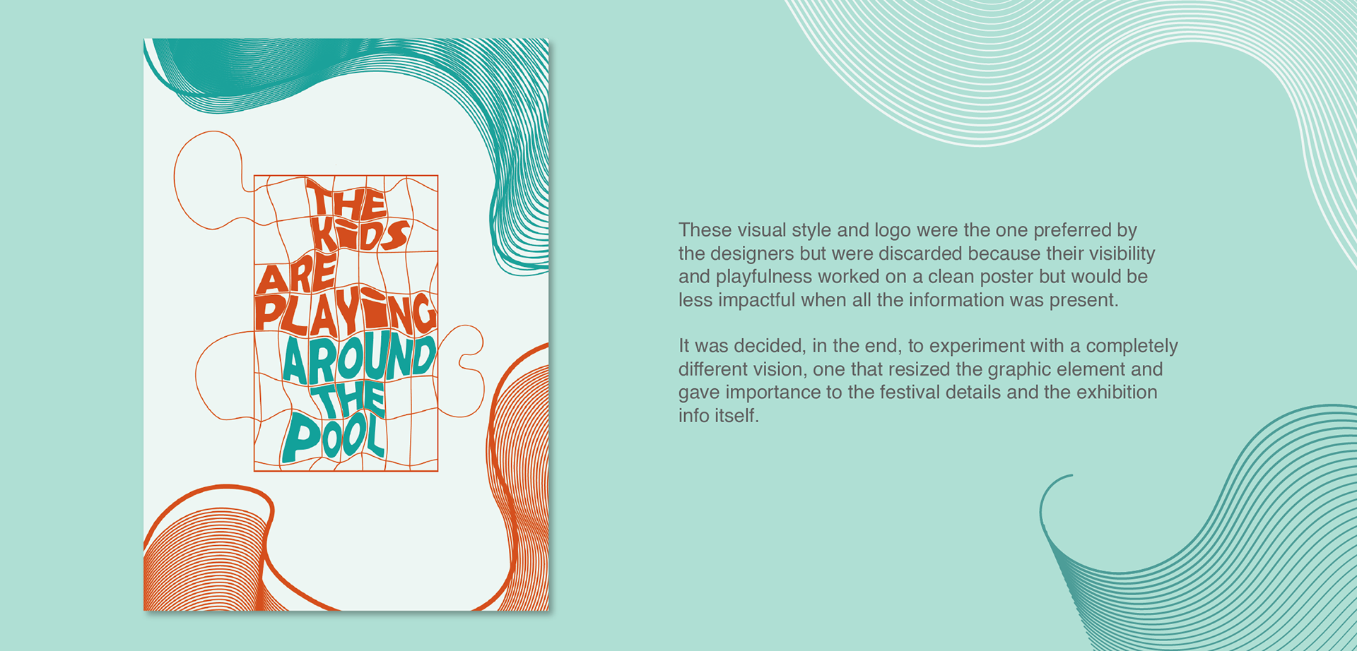
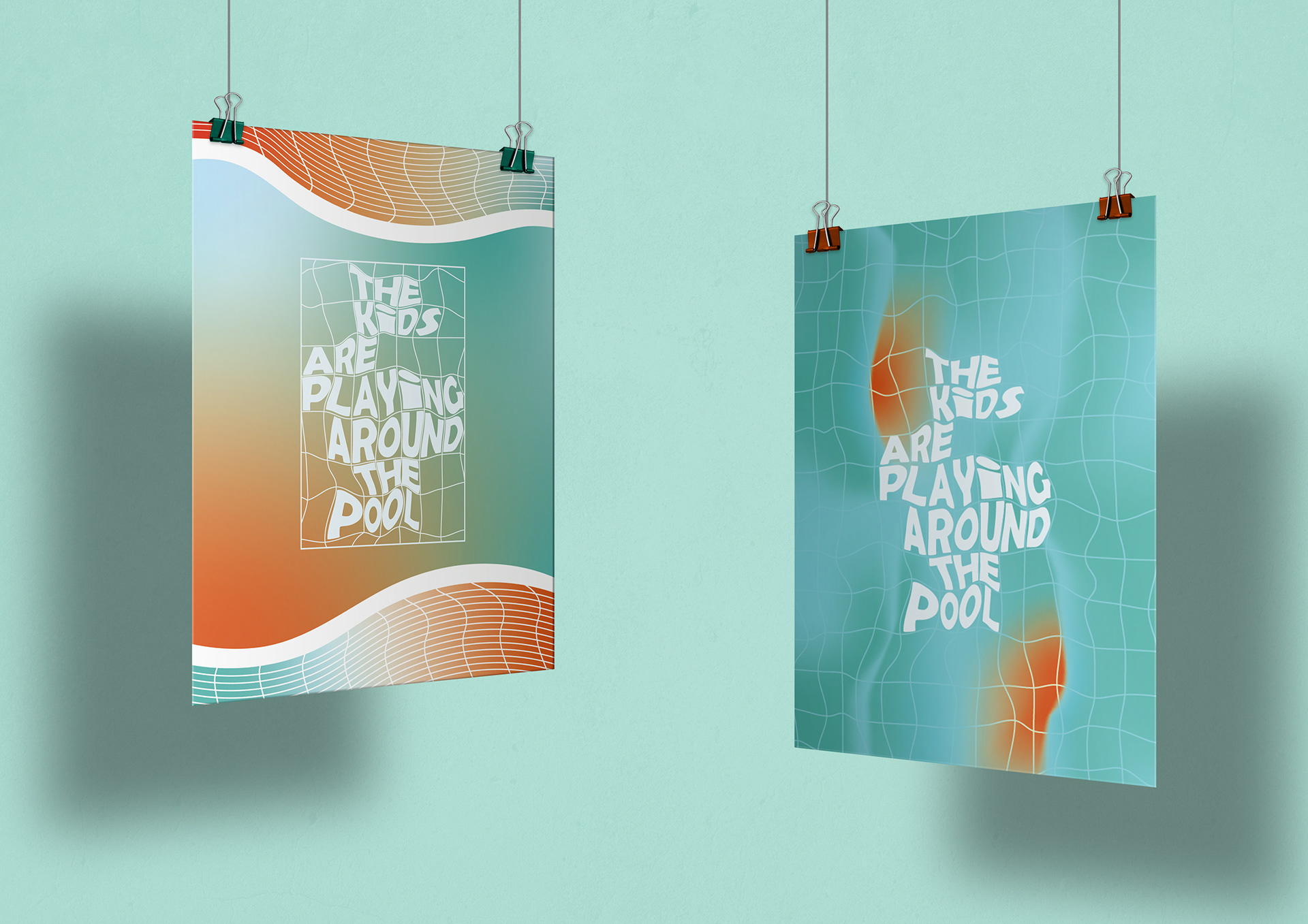
Unfortunately, though, this approach was far from what the designers envisioned which, in the end, gave way to the third and final identity.
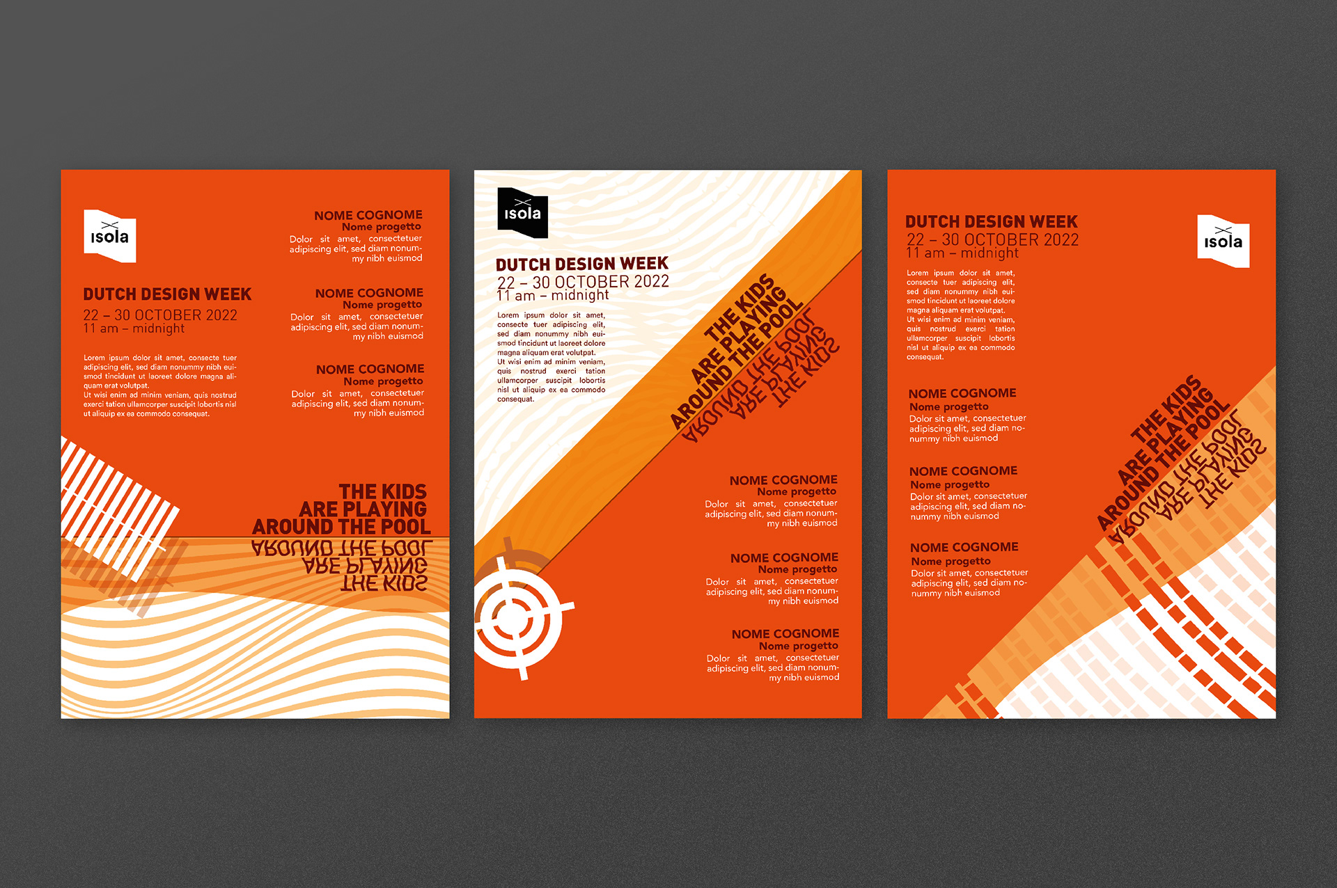
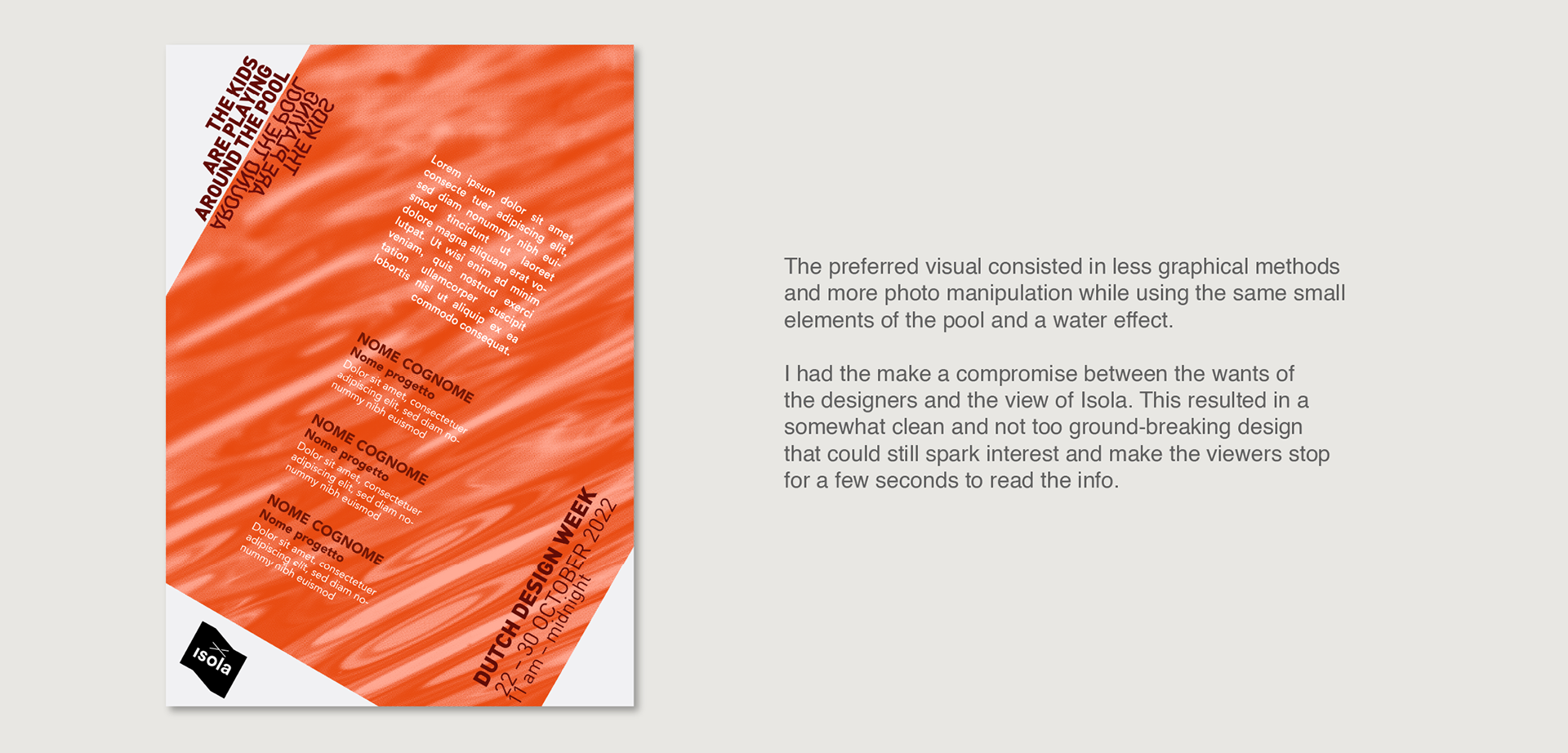
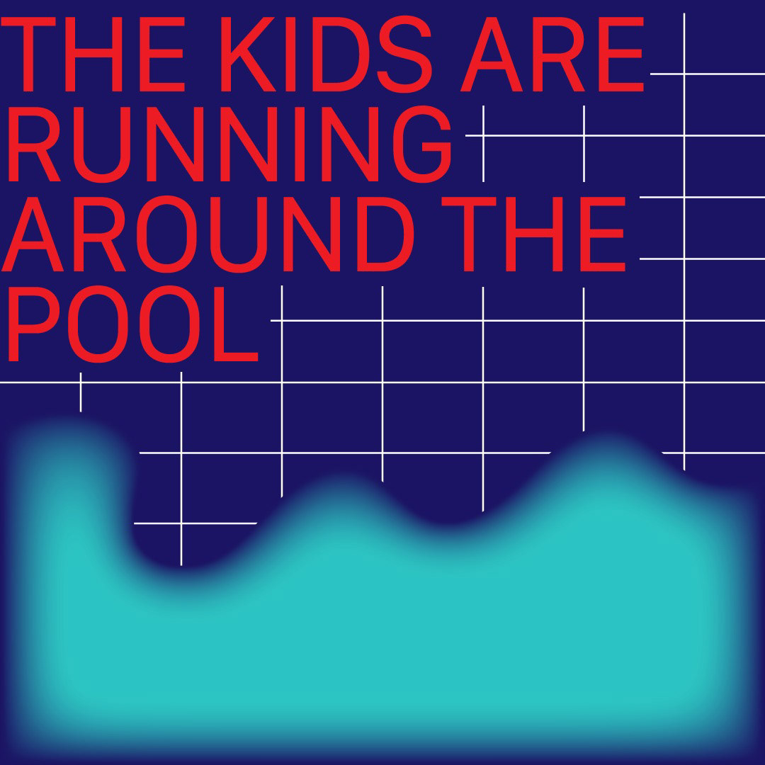
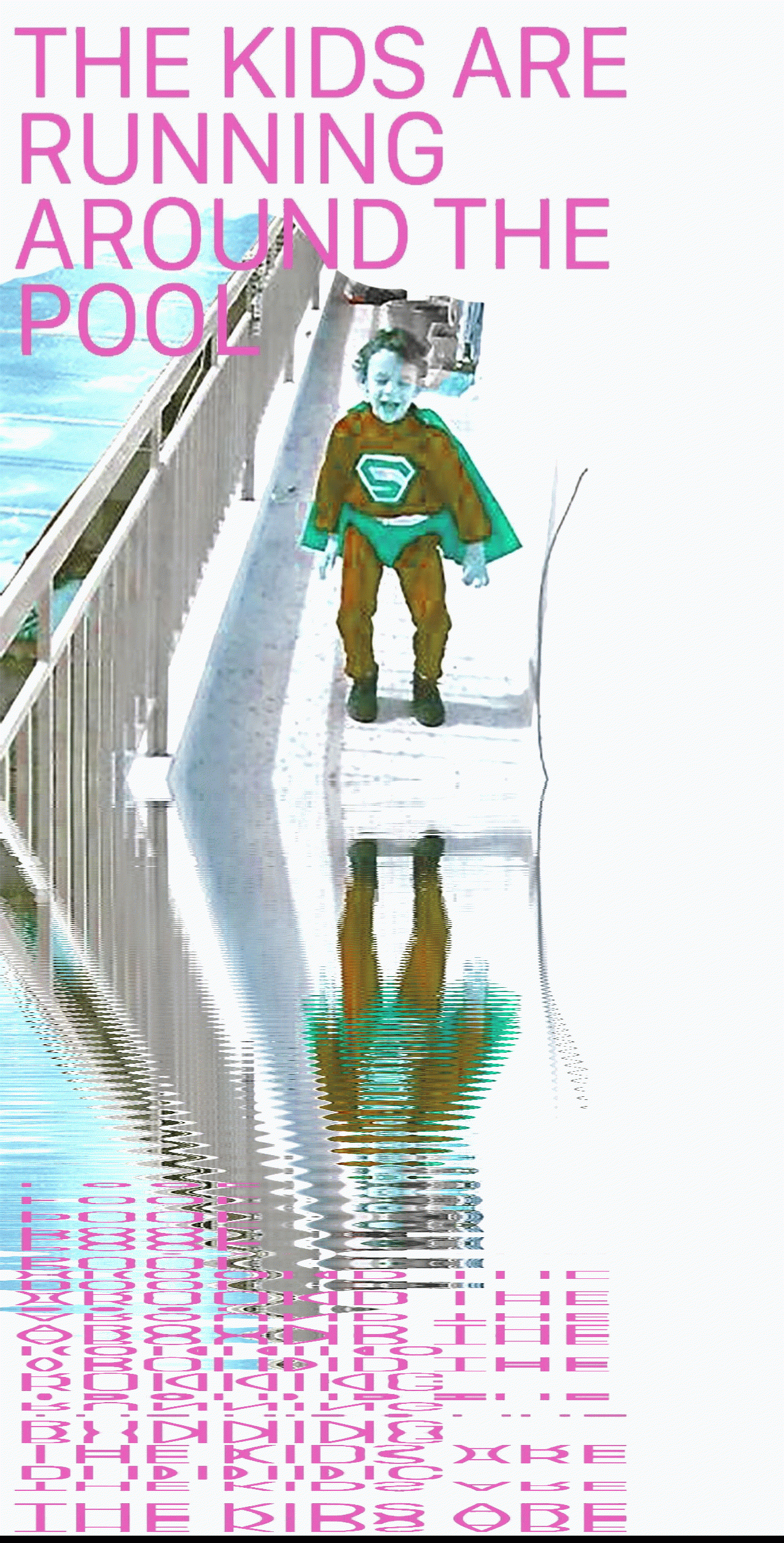
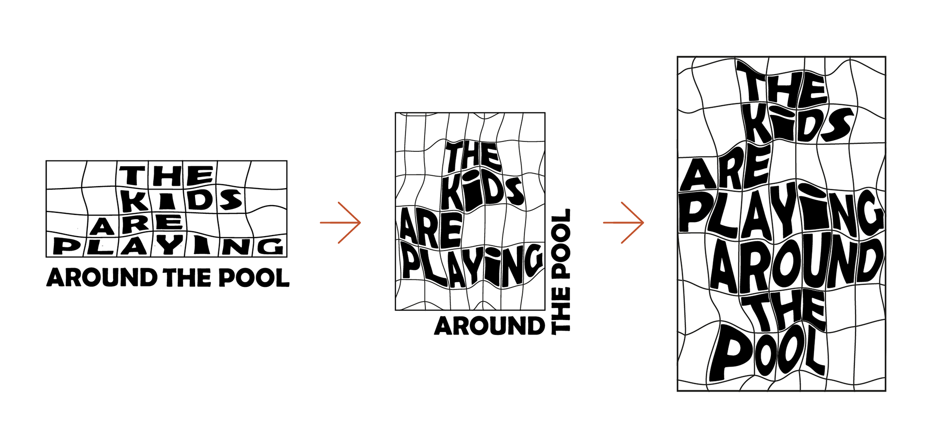
THIRD IDENTITY PROPOSAL
All of the proposals for this block were well liked by the team since it was nearer to the "more cinematic poster, which includes abstractism and a touch of mystery" that they were searching for.